
I’m sure there are other creative designers out there who can empathize with my obsession with typography. Serifs, sans-serifs, old style, handwritten, decorative, display: I love them all each in their own way.
A great font can add to your brand identity. Unfortunately, the exploration of new fonts and the ability to obtain them can come at a high price if you aren’t careful and resourceful. Thanks to places like Google Fonts, Adobe Fonts, Font Squirrel, and others, I was able to find a few great typeface alternatives to some designer favorites, all at no cost to you.
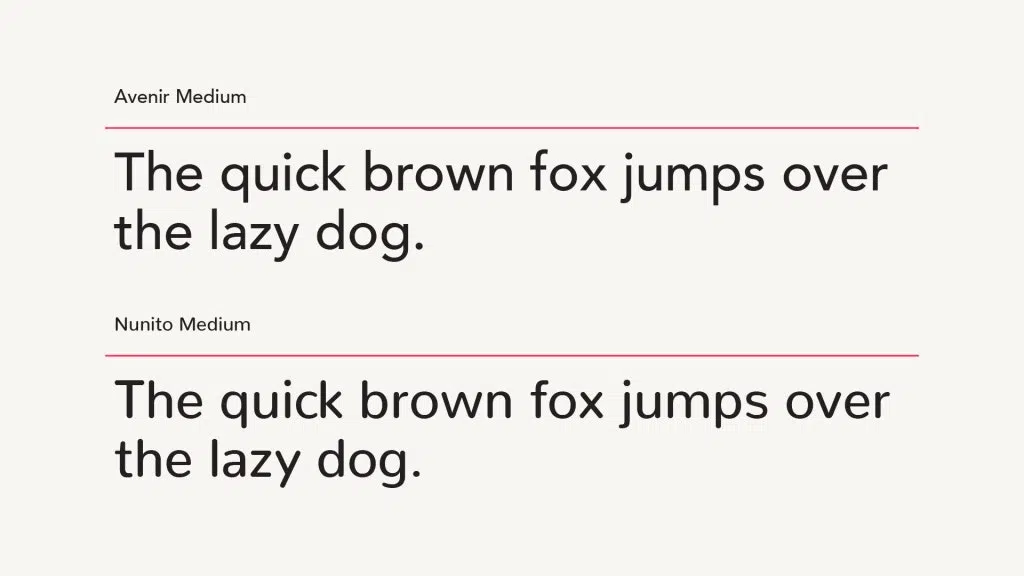
1. Avenir—Free Alternative: Nunito
Avenir is a geometric, linear sans serif that’s dynamic in all its uses—both body copy and headlines. It was designed to be similar to Futura, but with its own stylistic twists.
Nunito is a great alternative to Avenir, with similar letter form shapes and geometric qualities. Besides its slightly shortened ascenders and its curved caps, it would be hard for the naked eye to tell them apart. Nunito is also a Google font.
 2. Gotham—Free Alternative: Montserrat
Gotham is a traditional American typeface that’s familiar to many, with its clean, straight edges and circular counters design. Its thicker letter forms give it strength and structure.
Montserrat is nearly a spot-on match to Gotham with all the same sans-serif qualities. Montserrat is also a Google font.
3. Rockwell—Free Alternative: Enriqueta
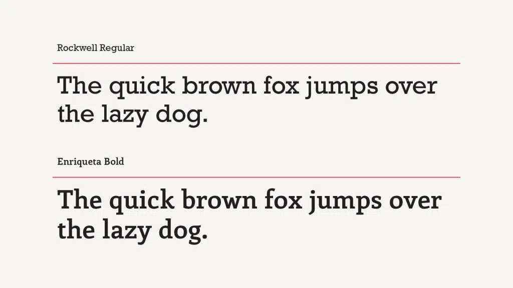
Rockwell is a slab serif typeface available in multiple weights, and great for use in bold headlines or logos.
Since the last time we talked about fonts, Rockwell’s been added to Adobe Fonts, so it’s available to anyone who uses Adobe Creative Suite. But if you don’t, Enriqueta is a great alternative with similar bold slab serif qualities and curved letterforms. Overall, Enriqueta is slightly more condensed than Rockwell and a little less circular, which you can see in letters like O, E, and D. Enriqueta can be found on Font Squirrel.
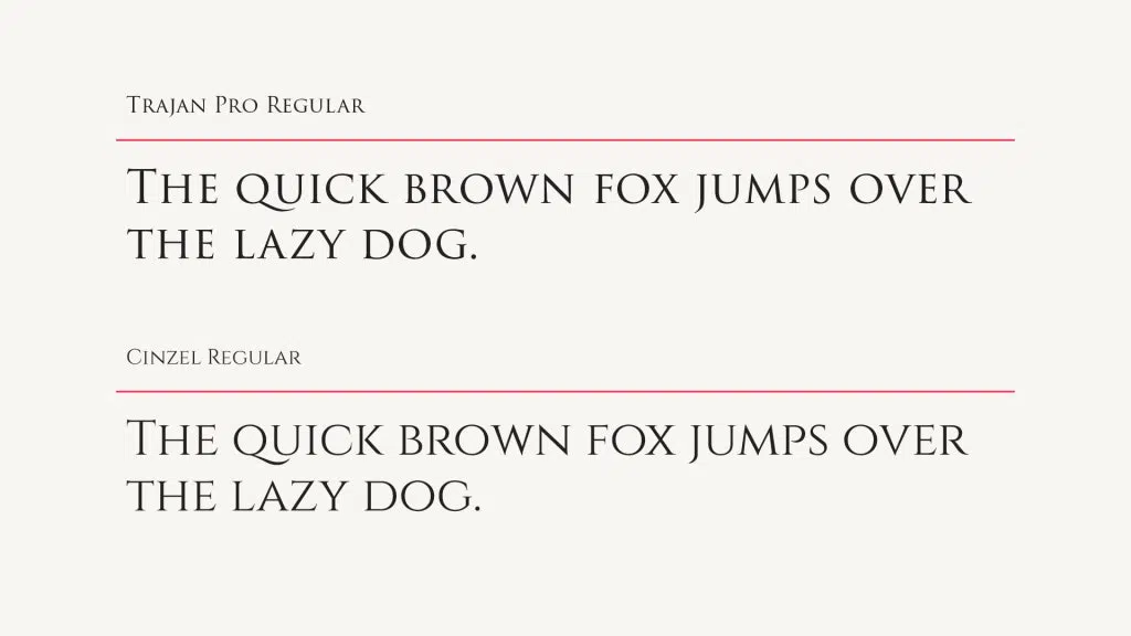
4. Trajan Pro—Free Alternative: Cinzel
Trajan Pro, an original Adobe typeface, is characterized by its thin serifs, curved descenders, and Roman influences. It is also an all-caps typeface. It’s also now available free through Adobe Fonts. But if you’re still looking for an alternative, Cinzel, a Google Font, is a great free lookalike for Trajan Pro with just a few minor differences.
Cinzel is slightly lighter weight and condensed letters like the E and G make it a nearly identical match!
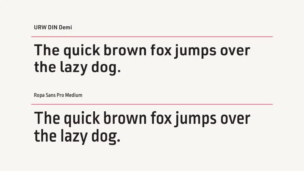
5. URW DIN—Free Alternative: Ropa Sans
DIN is a sans-serif font originally used for technical and analytical purposes. It’s out of copyright nowadays, which means a whole host of versions now exist—and that can get pretty convoluted when a file gets passed from designer to designer, sometimes using different versions of DIN. If you want to use a version of DIN, use URW DIN, which can be found on Adobe Fonts.
Ropa Sans is also a close match with DIN’s technical and scientific feel, and can be found for free on Google Fonts. In comparison to DIN, it’s more condensed overall and its x-height is higher as well.
6. Futura—Free Alternative: Renner*
Futura is a sans-serif typeface developed in 1927, which, as you might guess by its inclusion in this list, has grown to be a classic still popular today because of its timeless geometric beauty.
The differences between Futura and our recommended alternative Renner* are subtle—Renner* is also based on near-perfect circles, triangles, and squares, but the weight and size of the characters is slightly decreased.
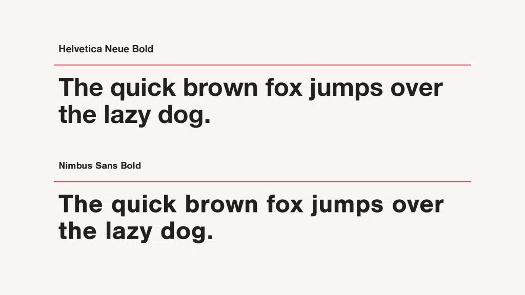
7. Helvetica Neue—Free Alternative: Nimbus Sans
If you know fonts, you know Helvetica. It’s one of the most popular typefaces of the 20th century, sans-serif or not, and its popularity hasn’t waned a bit over the first couple decades of the 21st century. Helvetica Neue is a reworking of the typeface from 1983, with a more unified set of weights and heights across the characters as well as improved legibility.
Nimbus Sans, found on Adobe Fonts, was created with Helvetica as inspiration, and to the untrained eye the difference is negligible.
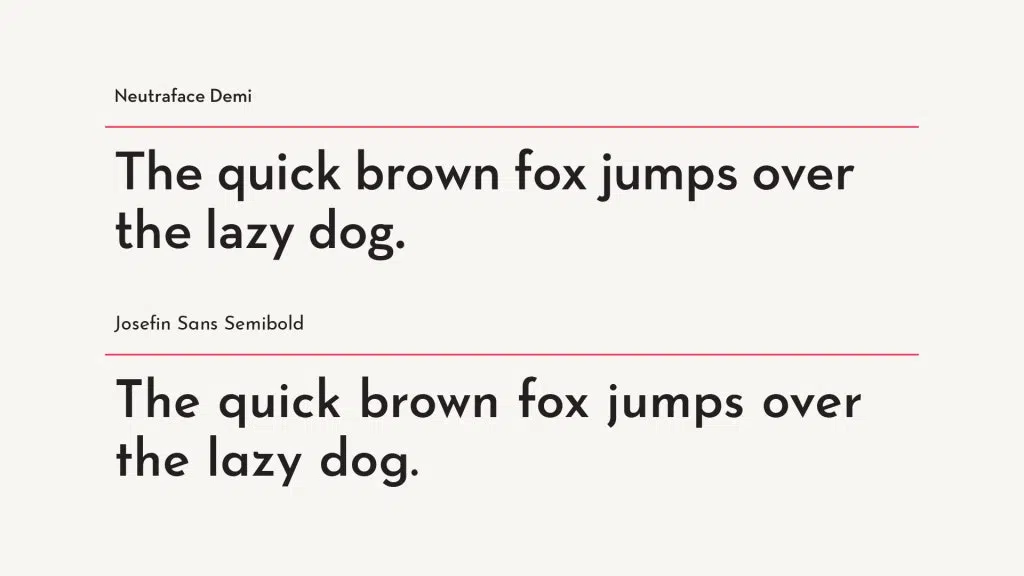
8. Neutraface—Free Alternative: Josefin Sans

Neutraface was designed about a decade ago in an attempt to build “the most typographically complete geometric sans serif family ever,” based on the principles of design used by architect Richard Neutra.
Josefin Sans is inspired by geometric sans-serif designs from the first half of the 20th century, much like Neutra’s work.
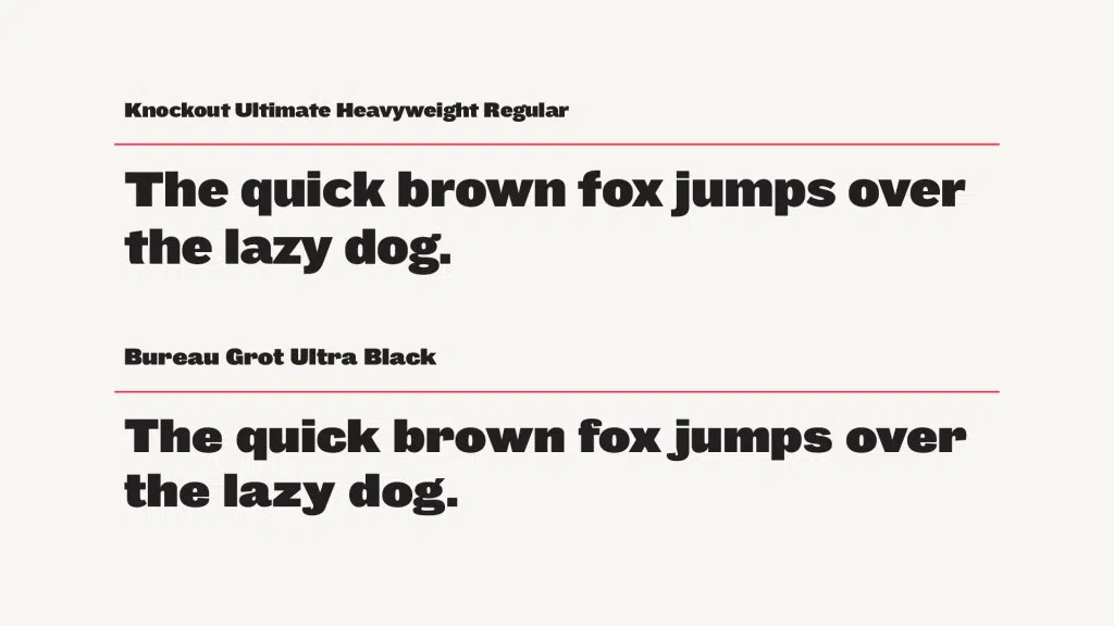
9. Knockout—Free Alternative: Bureau Grot
The Knockout font family offers a wide range of presentation styles not present in the majority of modern sans-serif families, providing the benefits of a well-designed collection and the visual appeal of individually designed fonts alike.
The range of Bureau Grot styles provides similar flexibility in a style not far from the original (and, again, it’s free).
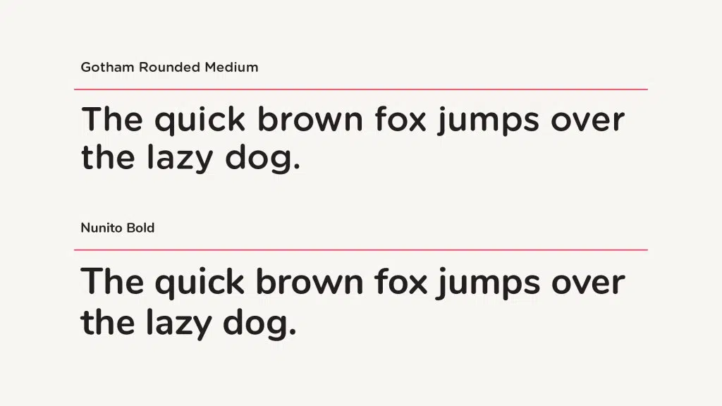
10. Gotham Rounded—Free Alternative: Nunito
Inspired by building signage, Gotham Rounded is a celebration of the alphabet used by draftsmen designing America’s great skyscrapers and buildings across the country, precise yet sensitive.
Nunito—again a match—holds onto Gotham’s rounded shapes and ability to be either fun or serious depending on the setting—and it’s free.
I hope these typeface alternatives will come in handy the next time you find yourself in need of a typeface listed above. For other great font alternatives, make sure to check out Lost Type—their fonts are free for personal use, but do require a fee for commercial use. And if you’re willing to splash a little cash, there are even more amazing options—take a look at House Industries, Fort Foundry, Under Ware, PS Type Lab, Ohno Type Co, Beasts of England, Grilli Type, Positype, Hoefler & Co., Frere Jones, and Font Bureau.
The fonts and typefaces you use are one of the most important parts of how your business presents itself publicly, but they aren’t the end. They should function as part of a cohesive brand, to ensure you’re representing yourself in a consistent way that’s in line with your marketing and business goals.